Beautiful & Balanced Canva Font Pairings for Brands
Font eye-candy 🍬
It can be hard to find a nice font pairing when DIY’ing your brand. These Canva font combinations go together like pb & j.
Typography plays a crucial role in design. It affects readability, conveys the mood and personality of your brand, and is essential for crafting visually appealing designs. Let me just geek out for a second…When fonts are well-paired, they create a harmonious balance and enhance the overall visual story of your design. Fonts can make or break your brand strategy.
A quality brand should have 2-3 fonts (or a headline, subhead, body copy). Then keep it consistent by using those fonts only. Consistency is one of the best ways to build trust with your audience.
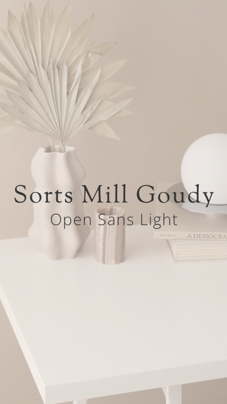
01 ✴ sorts Mill Goudy + open sans light
I love the simplicity of these two paired together and they create a nice balance and contrast of heavy and light.
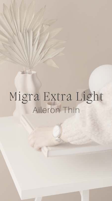
02 ✴ Migra extra light + aileron thin
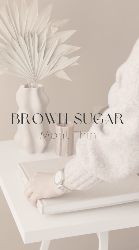
03 ✴ brown sugar + mont thin
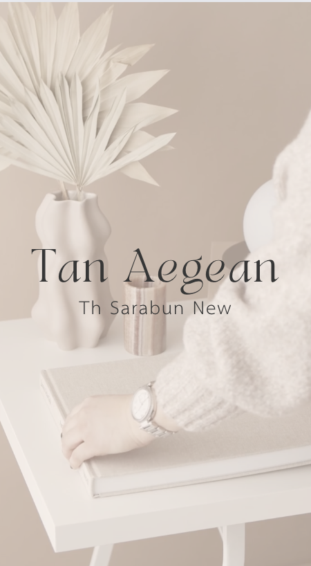
04 ✴ tan aegean + sarabun new
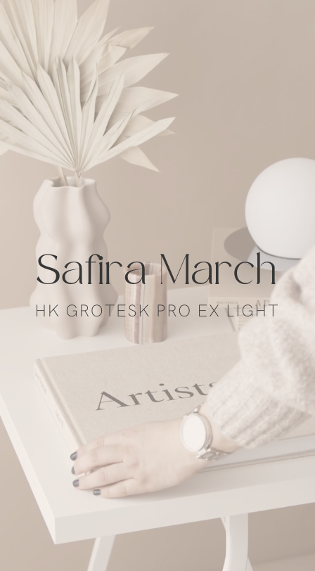
05 ✴ safira march + hk grotesk pro ex light
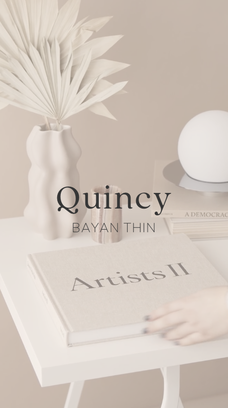
06 ✴ quincy + bayan thin
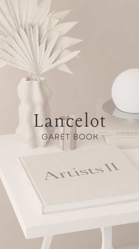
07 ✴ Lancelot + garet book
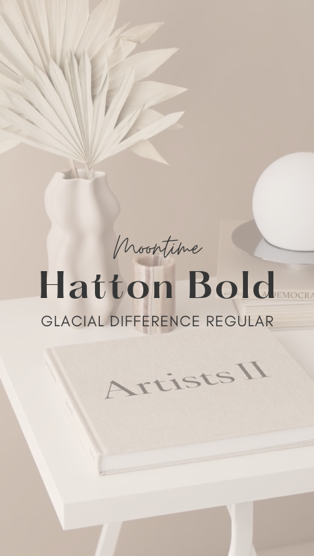
08 ✴ moontime + hatton bold + glacial difference regular
Like balance? The template shop has balance & style written all over it!
I bet you’ll also love to know…..